Wörterbuch
A word list you read, not a game you play.
Overview
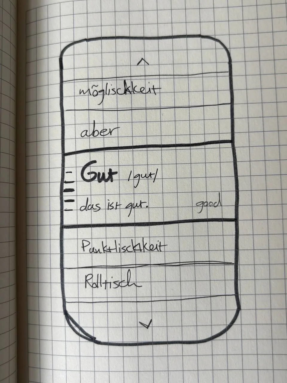
Wörterbuch is a vocabulary app for the telc B1 German exam. It is built around one interaction: the word in the centre of the screen is the word you are reading.
The telc B1 exam comes with a fixed list of about a thousand words. Most vocabulary apps turn that list into points, streaks and mascots. I wanted it to feel like a reference book.
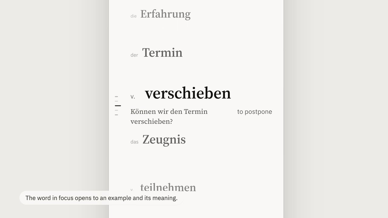
So there is one continuous list. The word at the centre grows and shows an example and its meaning. Its neighbours stay visible as plain words.
My role
Product and interaction design, and a working prototype.
- Context
- A personal project, for my own telc B1 preparation
- Tools
- Claude Design, HTML and CSS prototype, pen and paper
- Status
- Prototype with 18 entries. Not built as an app and not tested with other learners.
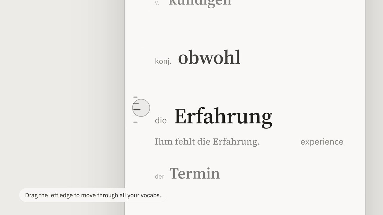
The prototype. Scroll normally, or drag the rail of ticks on the left to move through the list faster.
Key decision
Focus comes from position, not from a tap.
Scale and opacity follow each word’s distance from the centre of the screen, so nothing snaps. A half-focused word still reads as a plain word, and the detail only fades in near the middle.
I haven’t tested this with other learners. The idea that seeing a collapsed word quietly tests your memory is my intent, not a result.
Flashcards make a long list slow.
Flashcard apps treat each word as its own screen to flip, grade and dismiss. That is slow when you only want to see a word again, and it hides how words sit next to each other.
For me the points and streaks also pulled attention away from the words. I wanted the opposite: something closer to opening a notes app or a dictionary, plain and honest, with no decoration.
The word in the middle is the word you’re reading.
Scrolling a word to the centre expands it. The headword grows to full size, and the example sentence and the English meaning fade in. Words away from the centre shrink to a plain headword at 68% scale and half opacity.
Collapsed words keep their article, so der, die and das stay attached to the noun while you scan. Seeing a word above the fold and trying to place it before it arrives is a small, quiet way of testing yourself, with no quiz screen.
Hierarchy from size, weight and opacity.
No boxes, no labels and no accent colour. The page is warm off-white paper and near-black ink. A text serif carries what is read as language, the headword and the example, and a neutral sans carries the apparatus around it.
Headword
Source Serif 4, 38 pt, semibold. The biggest thing on the screen.
Article or part of speech
Plex Sans, 15 pt, grey, in a fixed slot before the word. Nouns get der, die or das. Everything else gets v., adj. or konj., so headwords line up.
Meaning
Plex Sans, 15 pt, grey, left-aligned under the headword like a note in the margin.
Example
Source Serif 4, 16 pt, a little lighter than the headword.
Things I changed along the way.
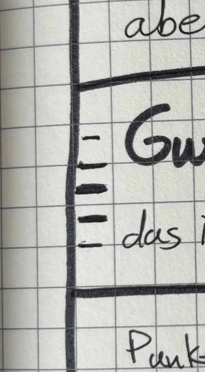
The rail began as tick marks in my notebook, a bit like the thumb tabs on the side of a printed dictionary.
Row height, 124 to 100
At 124 the focused word crowded out its neighbours. At 100 they stay in view, which matters because the neighbours are part of the idea.
Phonetics removed
The transcription added a third line without helping B1 learners at this stage. My first sketch had it for tricky words, and I took it out to keep each entry to a headword, a meaning and an example.
A rail you can drag
With about a thousand words, scrolling alone is too slow. A column of ticks runs down the left edge, and dragging along it scrubs through the list much faster. It sits beside the words, so ordinary scrolling still works the way you expect.
Article inline
Putting it before the headword in a fixed slot keeps the headwords aligned whatever the word type.
Open questions.
I explored a few things without settling them. Right now the rail only reflects position. It could also work as an alphabetical thumb index, or vary tick length by word type. I lean towards word type, because it survives a re-sorted list. I also looked at a first-launch screen, an end-of-list screen, and a short daily session such as 12 of 40 words instead of an endless scroll.
How words are ordered and repeated is deliberately separate from the interface. The design only needs to show a word, note whether it was known, and move on, so manual browsing, spaced repetition or something in between could sit behind it later. The plan for marking a word as known is to infer it from scroll speed and how long you stay on a word, with no tap.
What I took from it.
Taking features away was the design work. Phonetics and most of the detail on collapsed words went, and each time the list felt calmer. If I carried on, I would load the real word list, try it for a few weeks myself, and then ask a couple of other learners whether the words in the middle really stay in their heads.