A front page with a clear hierarchy
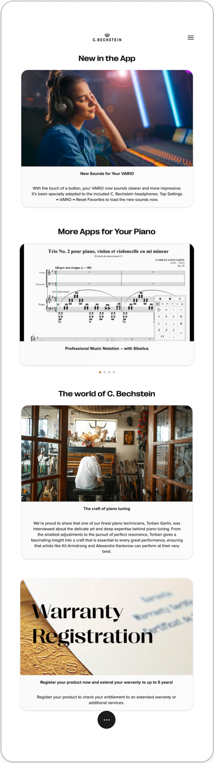
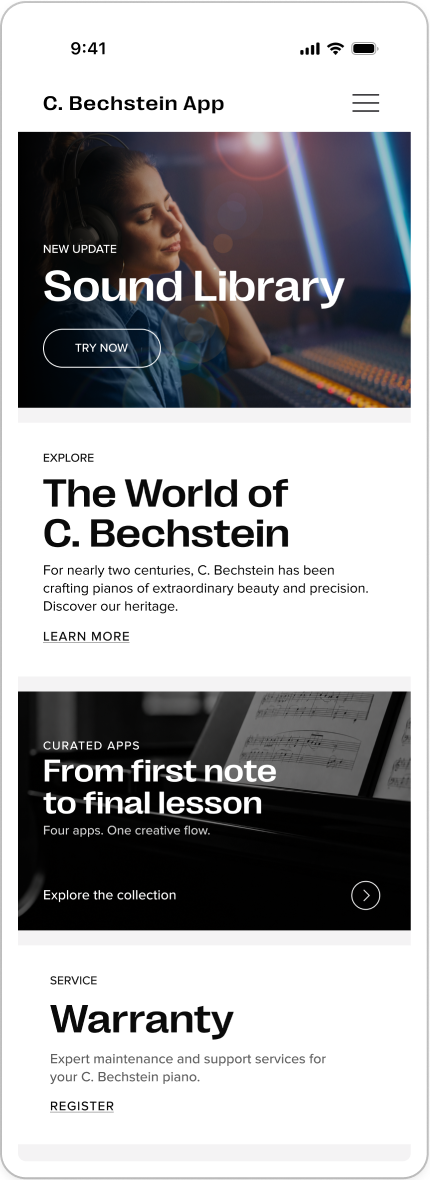
Home was a stack of small images with long captions, so nothing stood out. The content stayed the same. Clear headlines, bigger images, and one action per block now show what matters at a glance.
Before
After
Taking a half-finished app for connected pianos and turning it into one coherent product, ready for development.
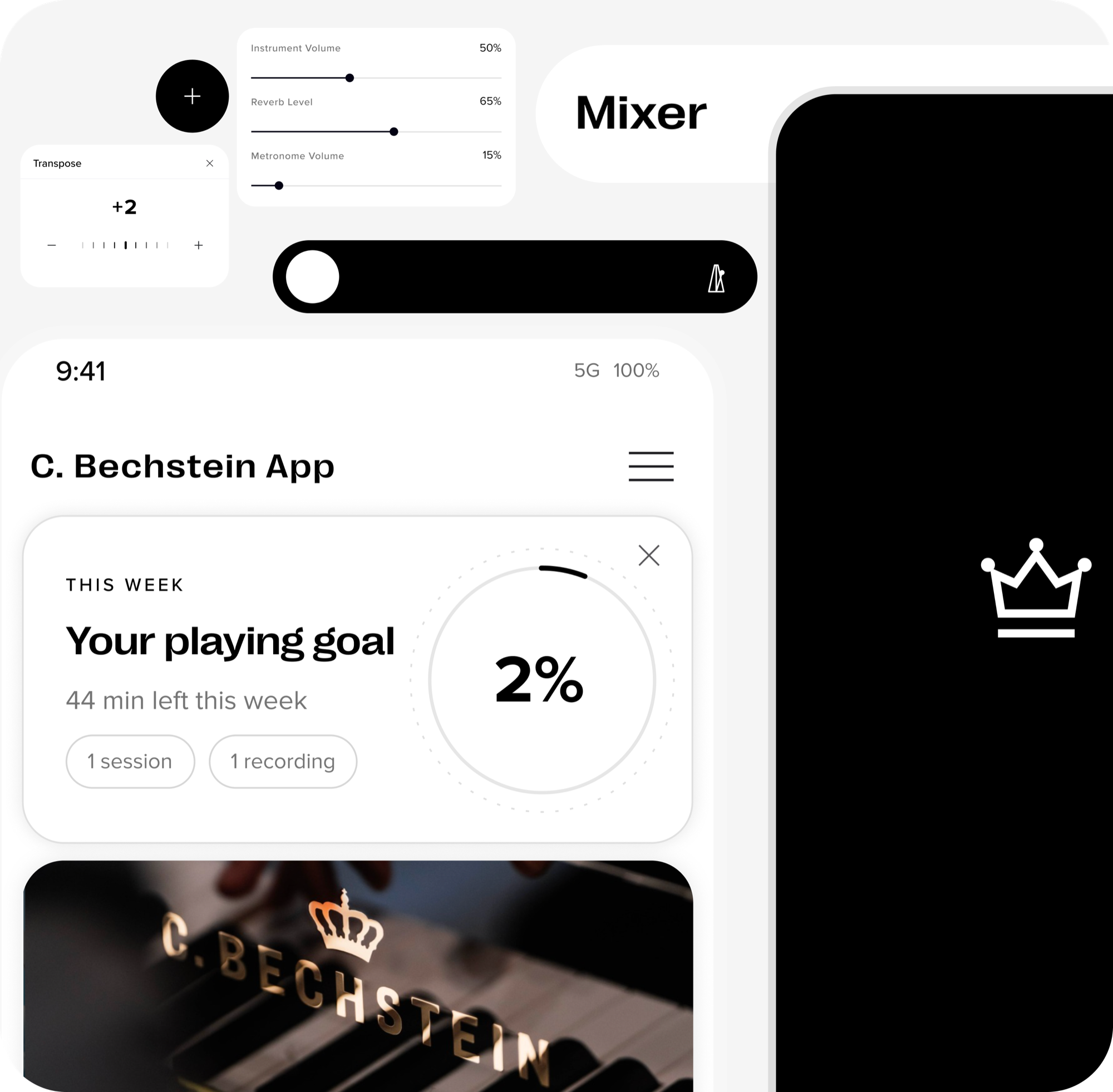
C. Bechstein is a German piano maker. Its connected pianos come with an app where owners can shape the sound, record what they play, and keep an eye on the instrument’s condition. When I started, that app was half there: some parts worked, others were missing, and nothing felt like it belonged together.
As product designer, I took the app from that state to a complete, consistent design. I audited what existed, restructured it, designed the flows that were missing, and documented everything in a design system.
The app could already do a lot, but it had no shared foundation. Before designing anything new, I audited what existed and found three problems running through the whole product.
The app when I started
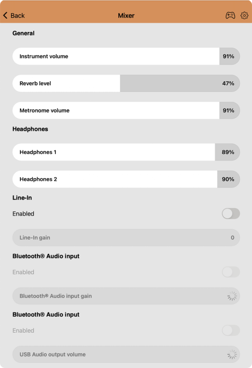
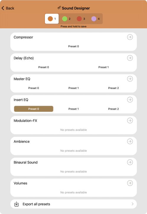
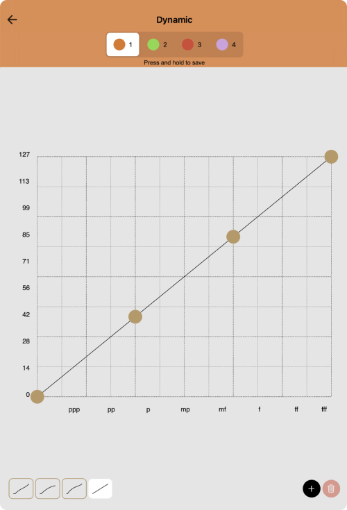
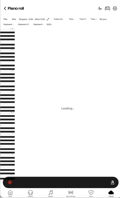
Each area had its own look and its own way of working, so moving around felt like moving between different products.
Recordings appeared as data tables and updates as build numbers, in an app meant for people who play the piano.
Most features had no introduction, or one page of long technical text. Setting up meant working it out alone.
A piano owner shouldn’t have to learn a new way of using an app. So instead of inventing new interactions, I used patterns people already know from the apps they use every day, and applied them the same way everywhere.
The same type, colour, spacing, and controls in every part of the app, so it finally reads as one product.
Long, crowded pages became short steps. Each screen asks for one thing and makes the next step obvious.
Screens describe what someone wants to do, not how the system works. Technical detail stays available, but out of the way.
Those three ideas shaped the whole app. Here is what that looked like in practice. Select a screen to enlarge it.
Home was a stack of small images with long captions, so nothing stood out. The content stayed the same. Clear headlines, bigger images, and one action per block now show what matters at a glance.
Before
After
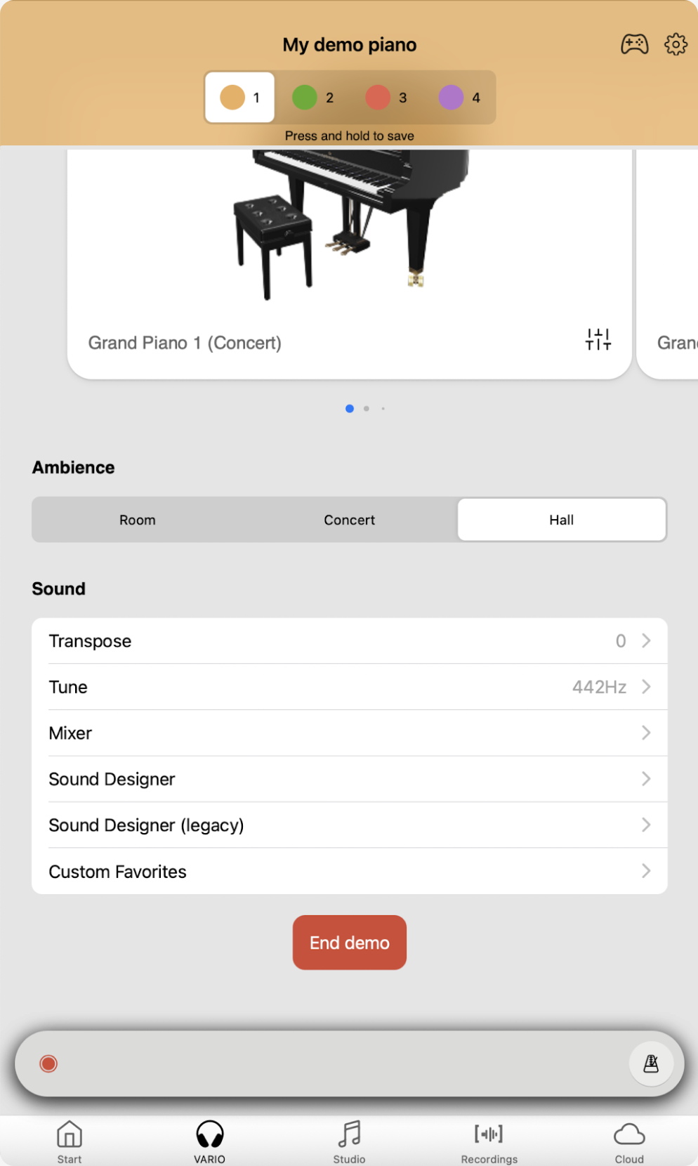
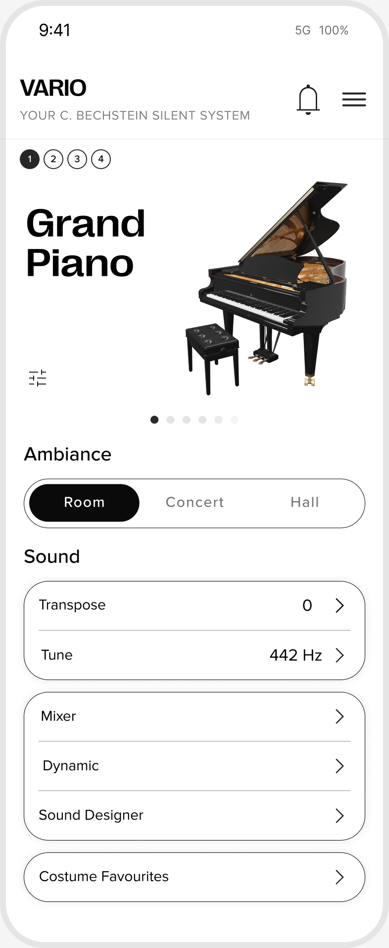
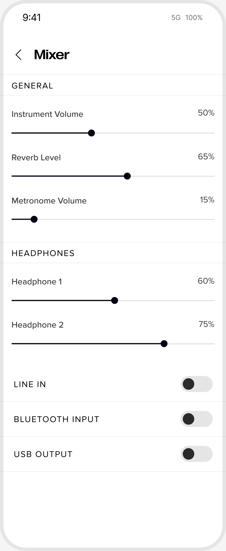
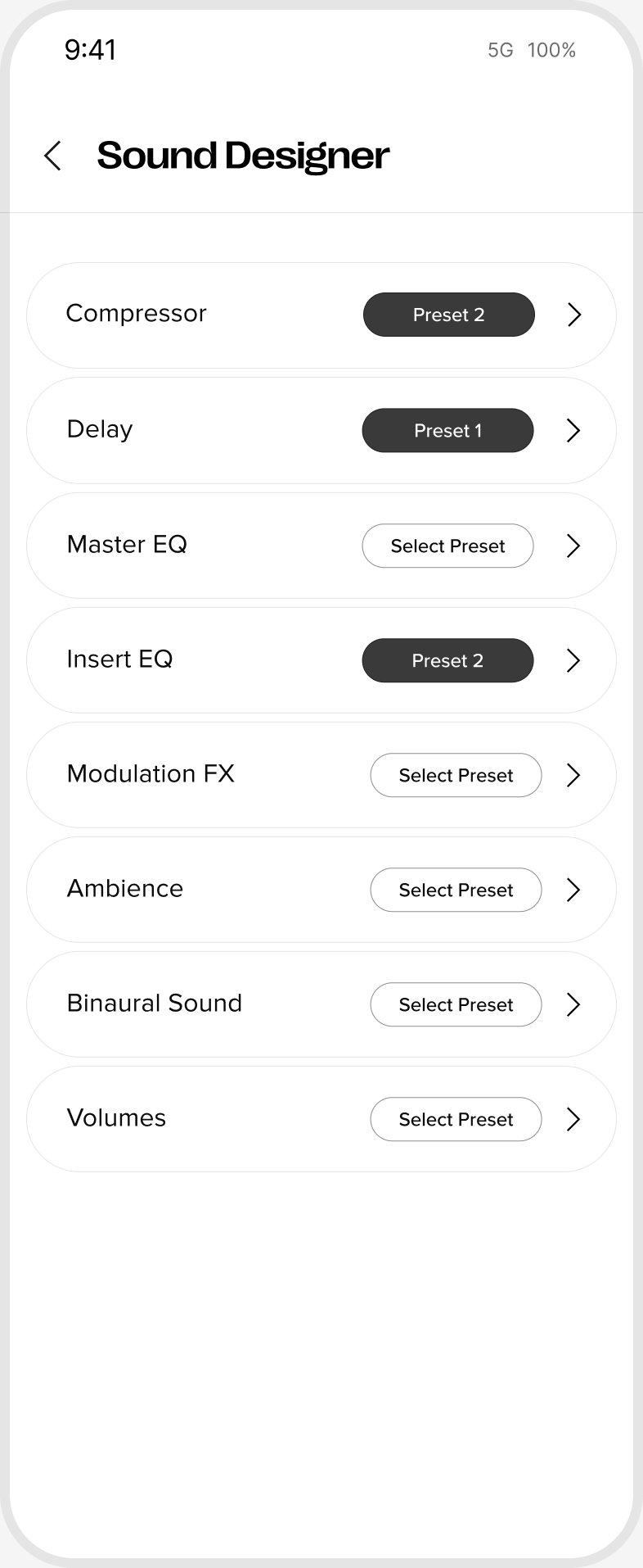
Shaping the piano’s sound should feel direct. The heavy orange headers are gone, the instrument takes centre stage, and every setting shows its current value without having to open it.
Before
After
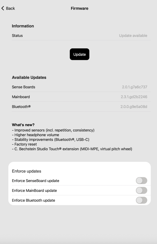
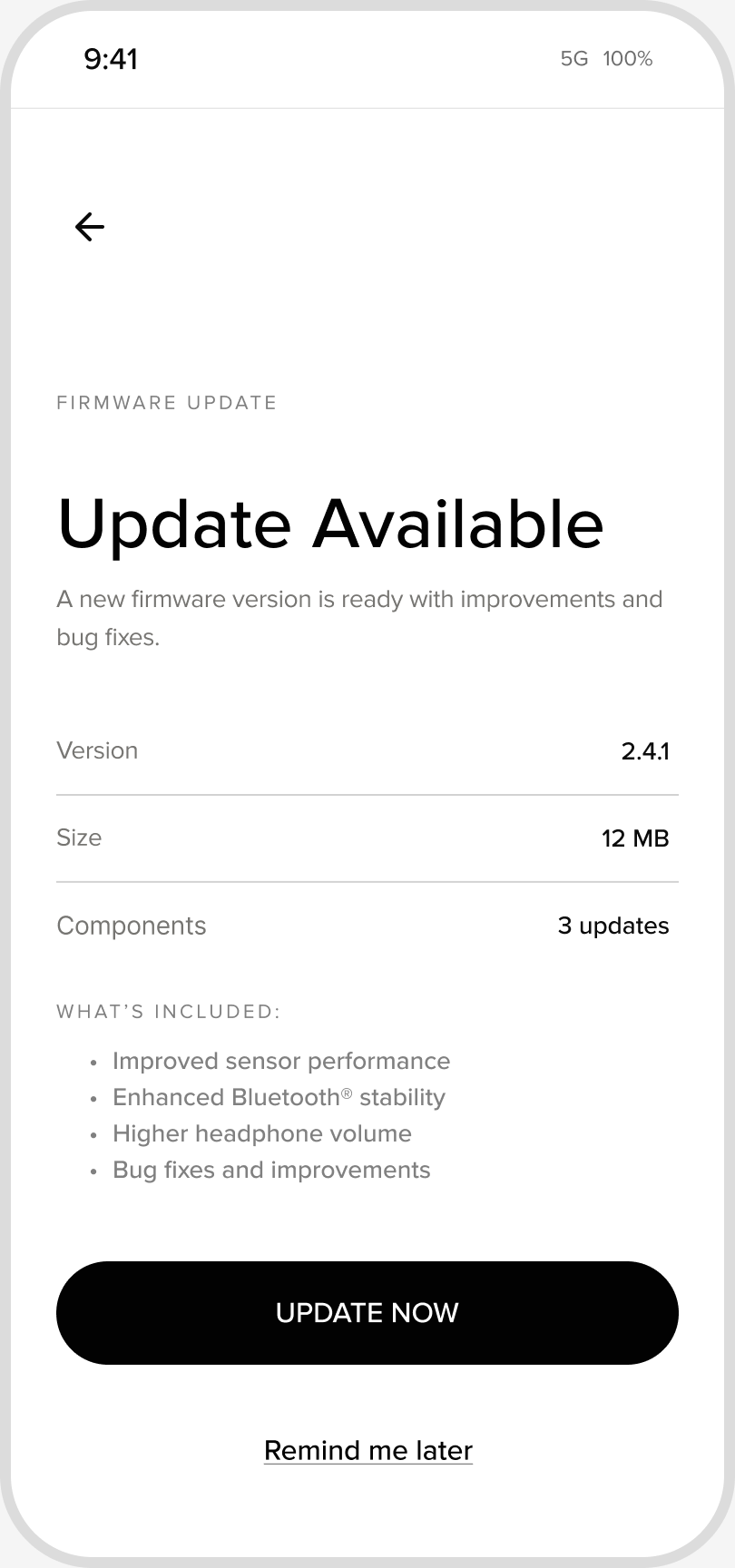
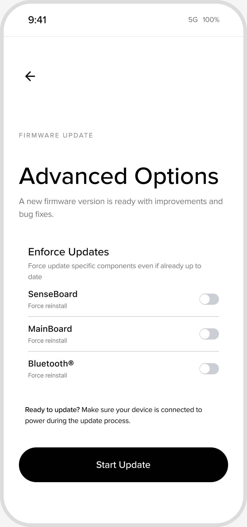
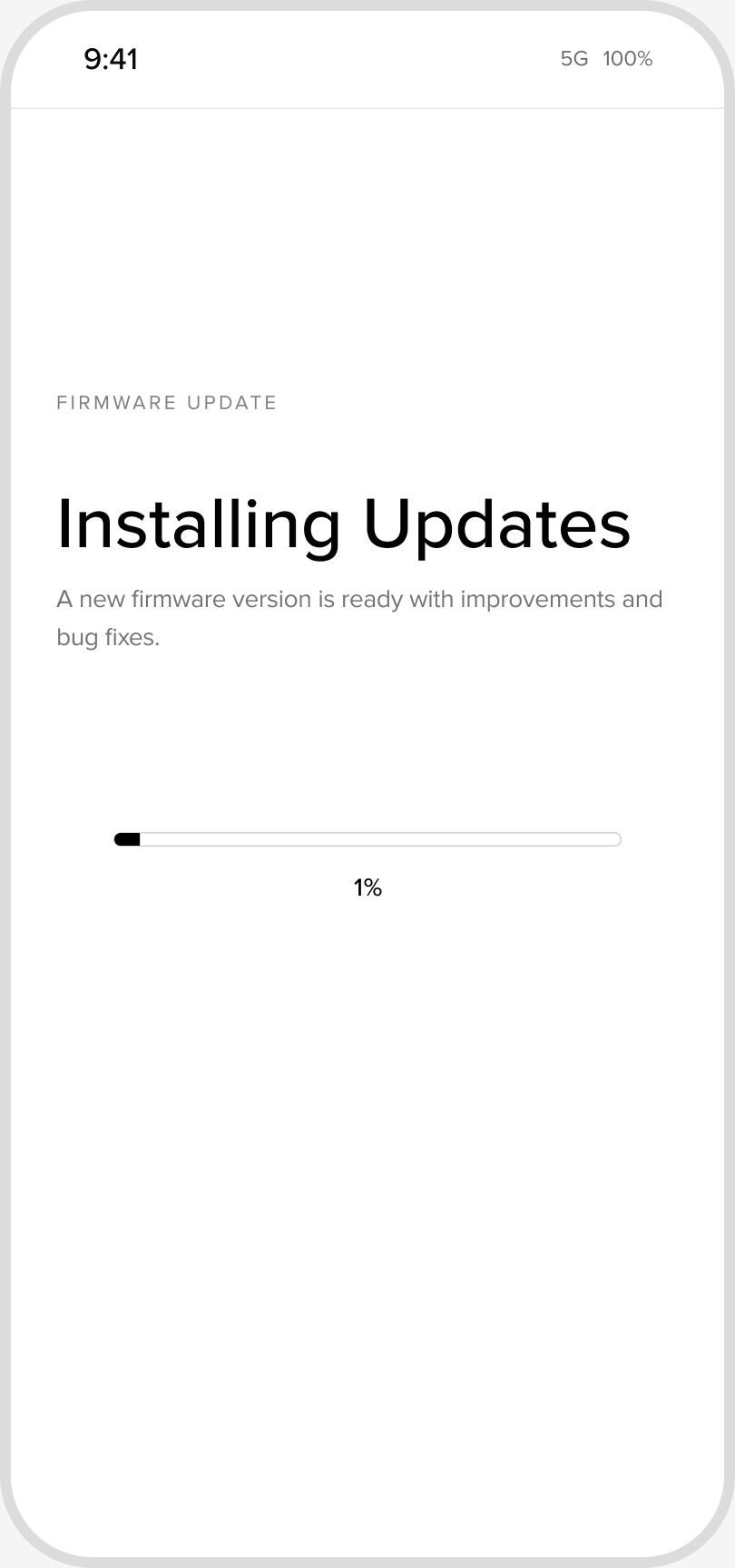
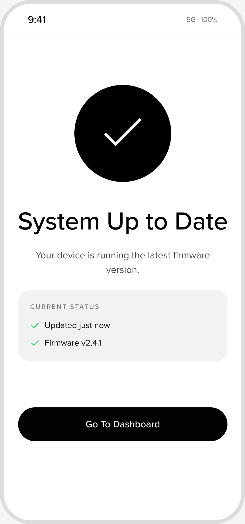
Updating the piano meant reading build numbers and deciding which parts to force. Now it’s a short flow: see what’s new, start, wait, done. The technical options are still there, one step away for those who need them.
Before
After
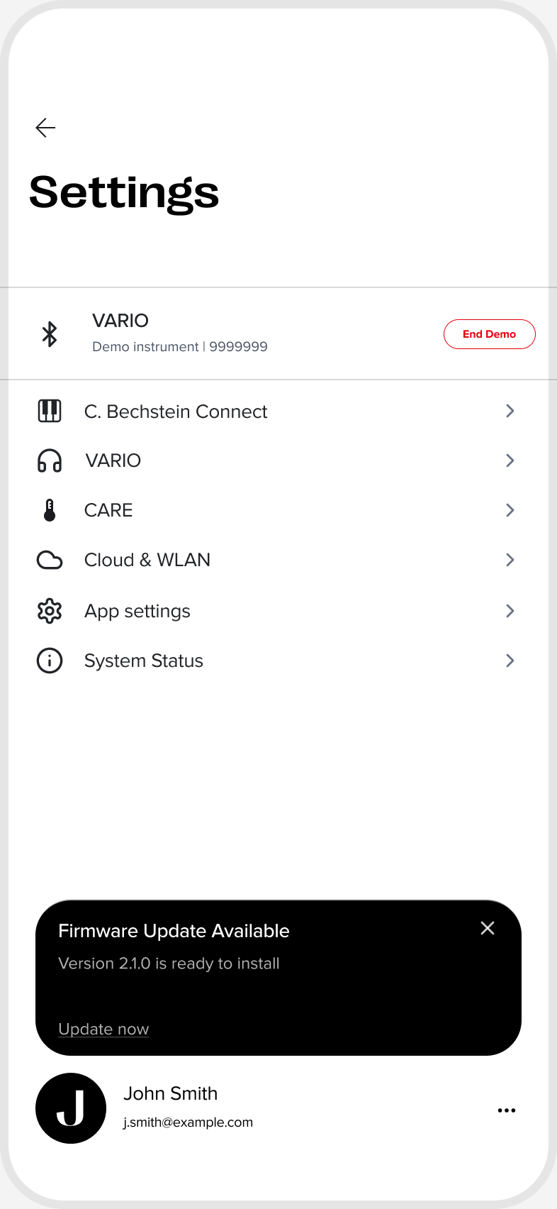
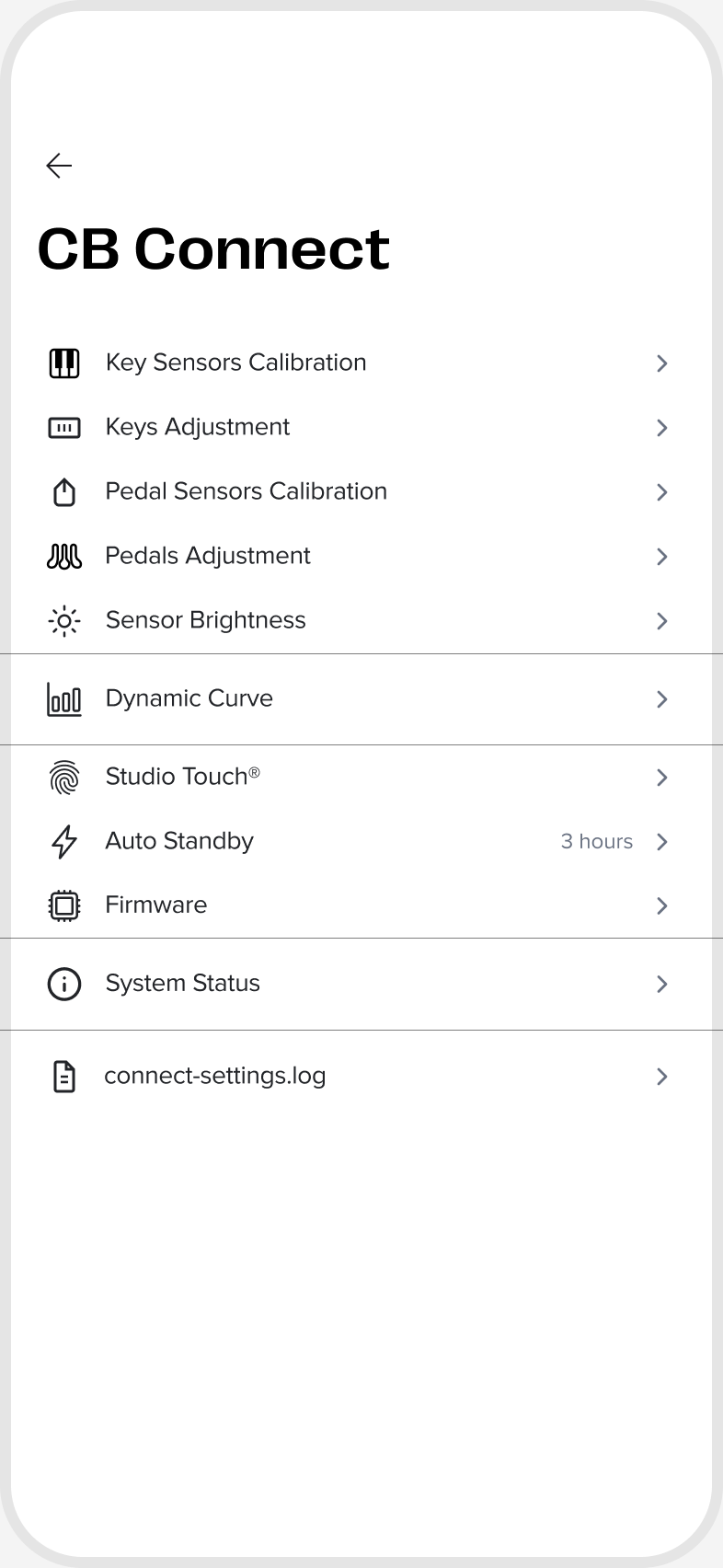
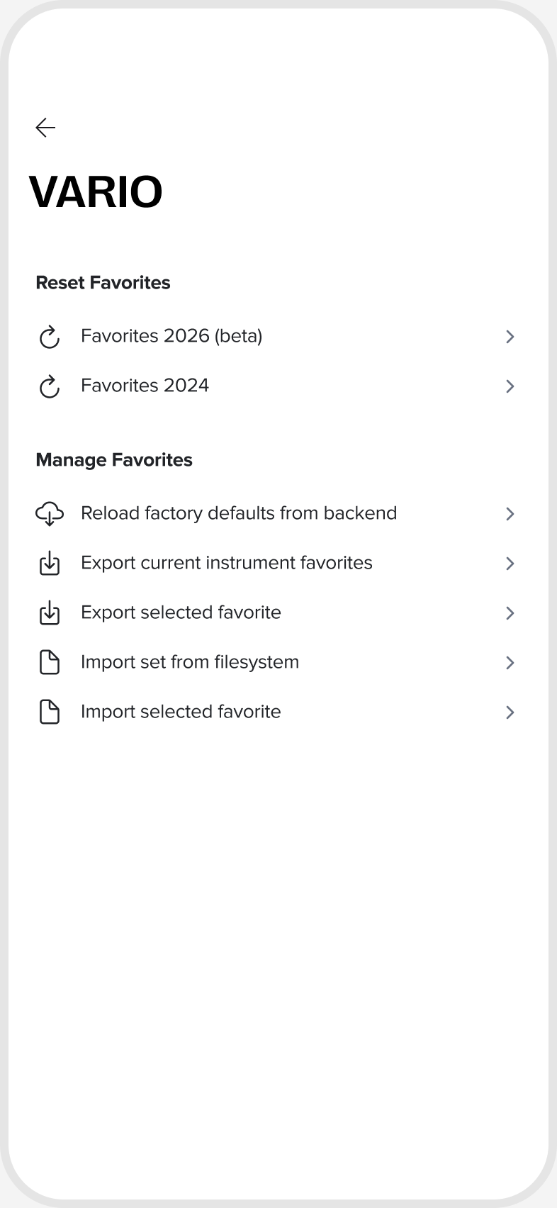
Everything lived in one long list. I grouped it the way people think about it: the piano, its connection, and the app. Settings are easier to find now, and there’s a clear place for whatever comes next.
Before
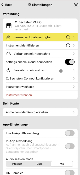
After
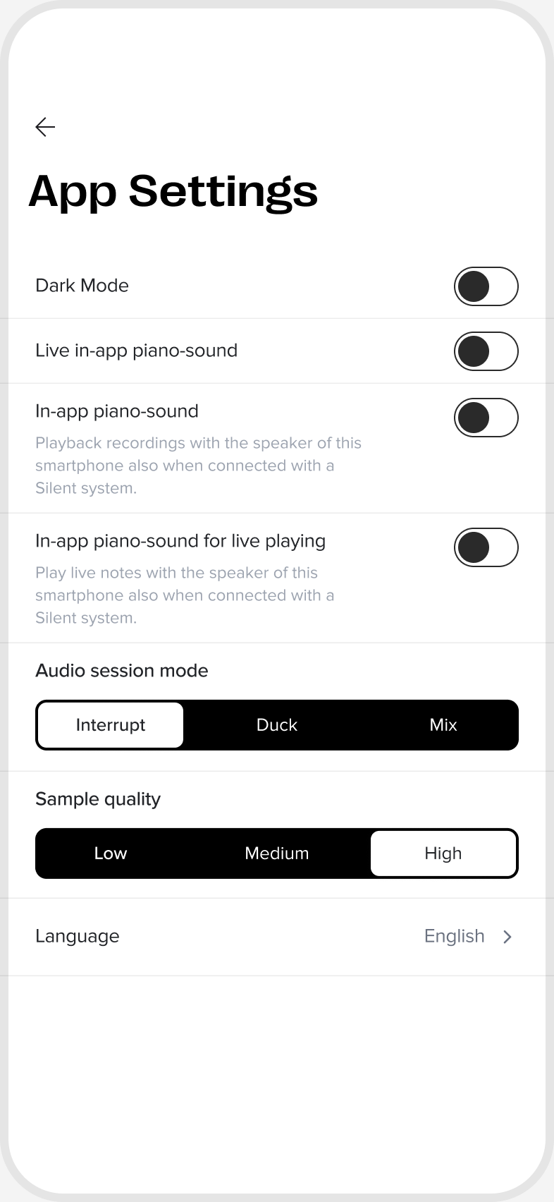
A recording was a table of note counts and chords, with the music itself on another screen. Now a session has a name, you see what you played first, and you can tag and edit your takes in the same place.
Before
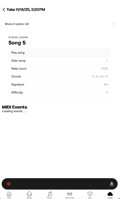
After
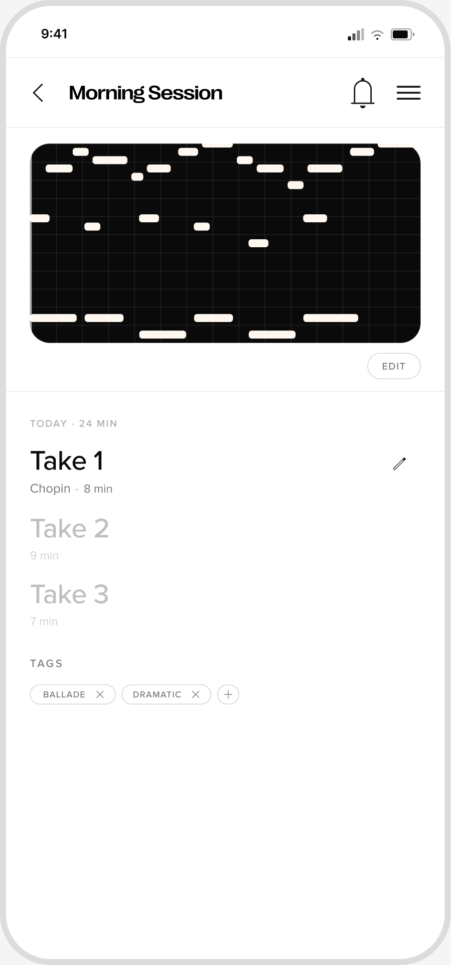
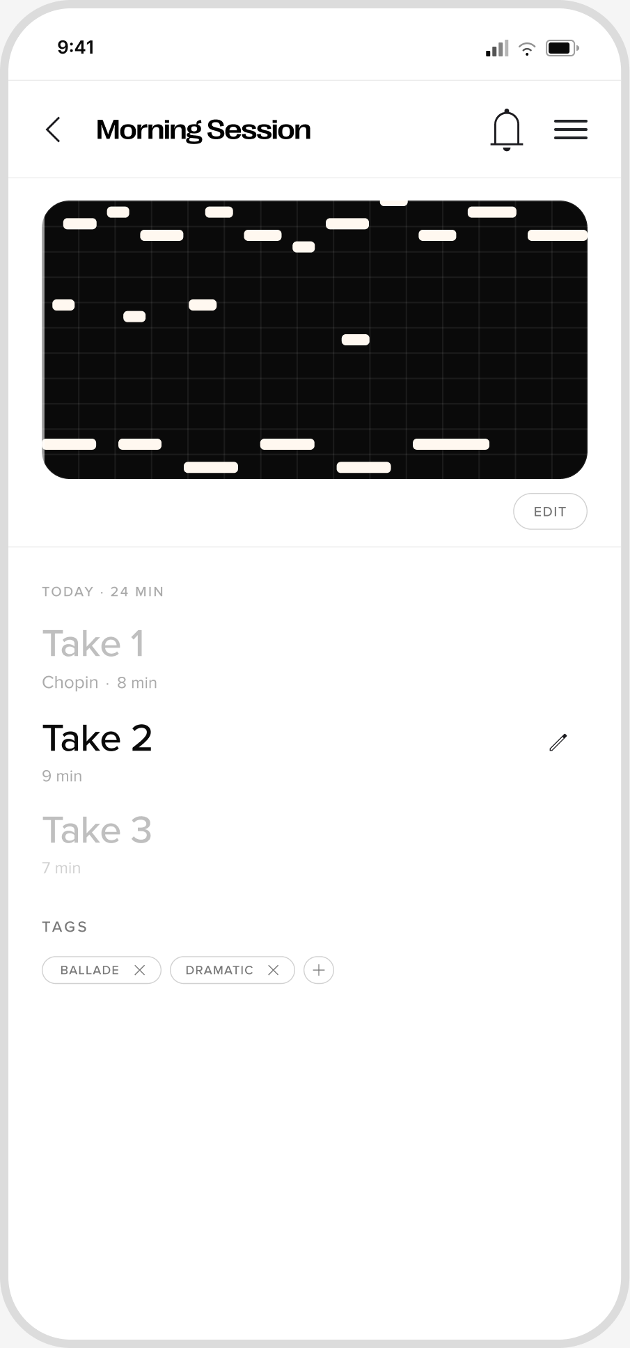
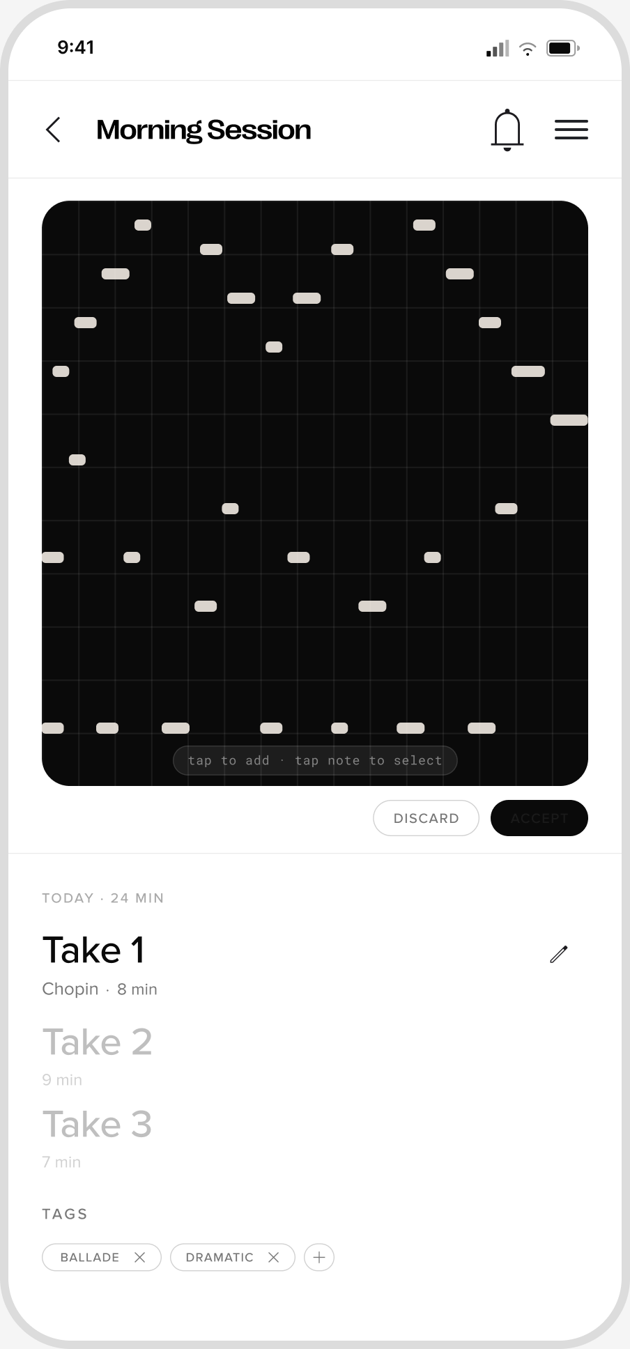
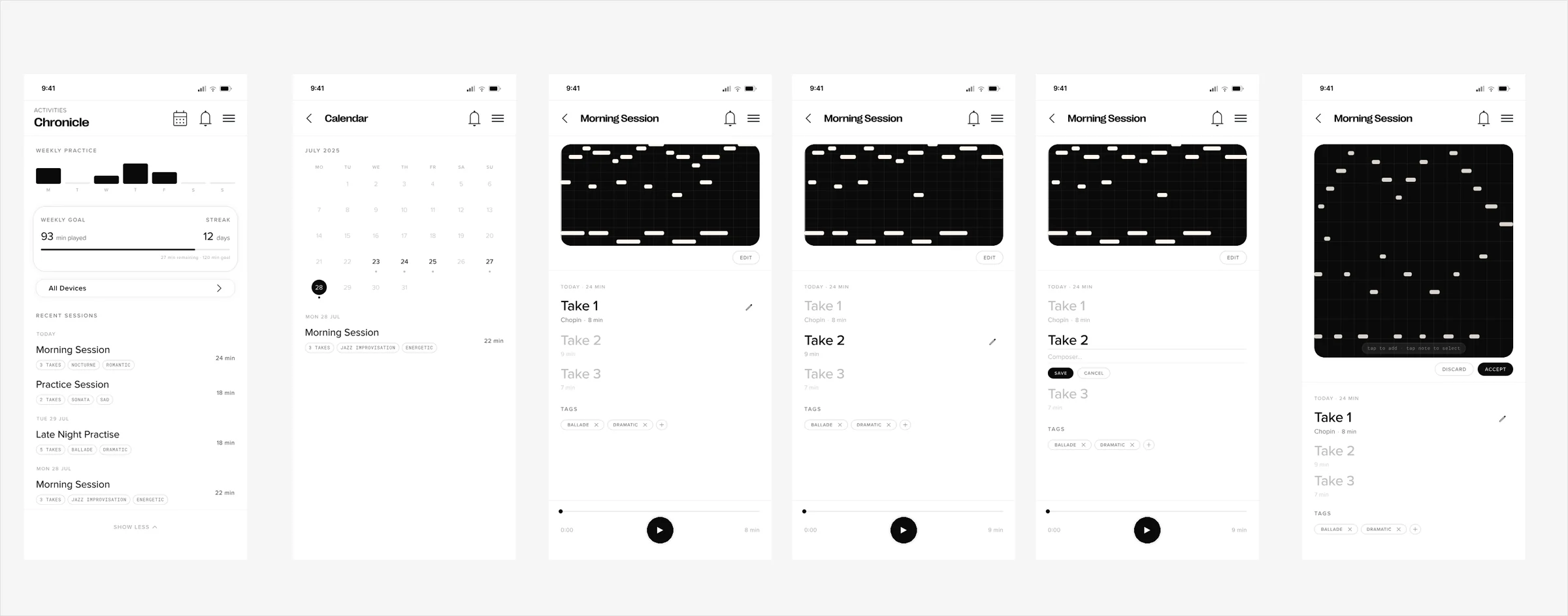
You might remember when you played something, or you might have filed it away on purpose. The app put both on one page with no clear relationship. I compared three structures and chose two simple tabs, so neither way of looking gets lost.
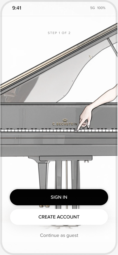
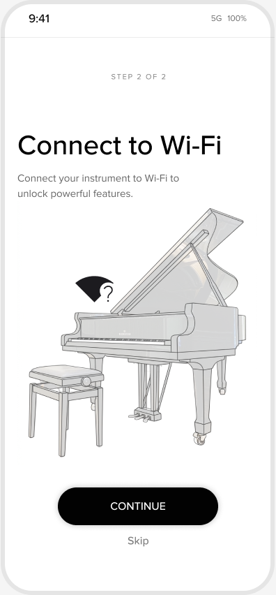
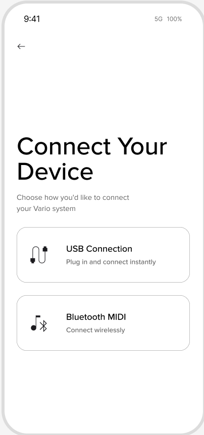
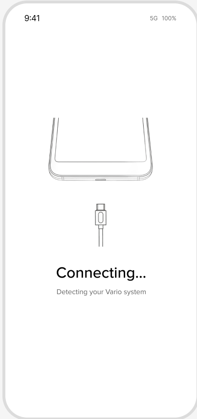
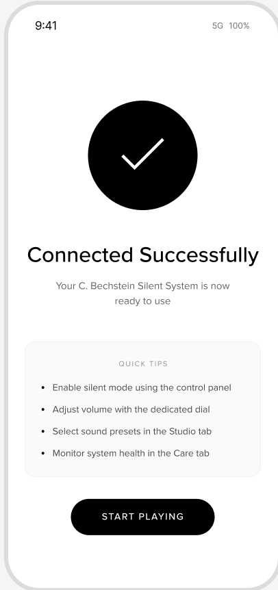
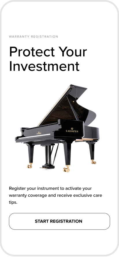
The biggest gap was the first experience. A new owner has to sign in, connect the piano to Wi-Fi, pair its silent system, and register a warranty, and most of that came with no guidance. I designed each as a short flow built the same way: one idea per screen, a visible next step, and a clear confirmation at the end.
Getting started
Connecting the silent system
Registering a warranty
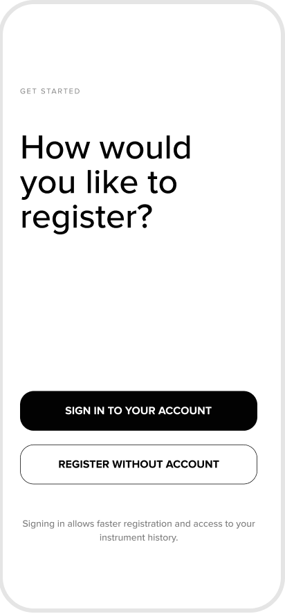
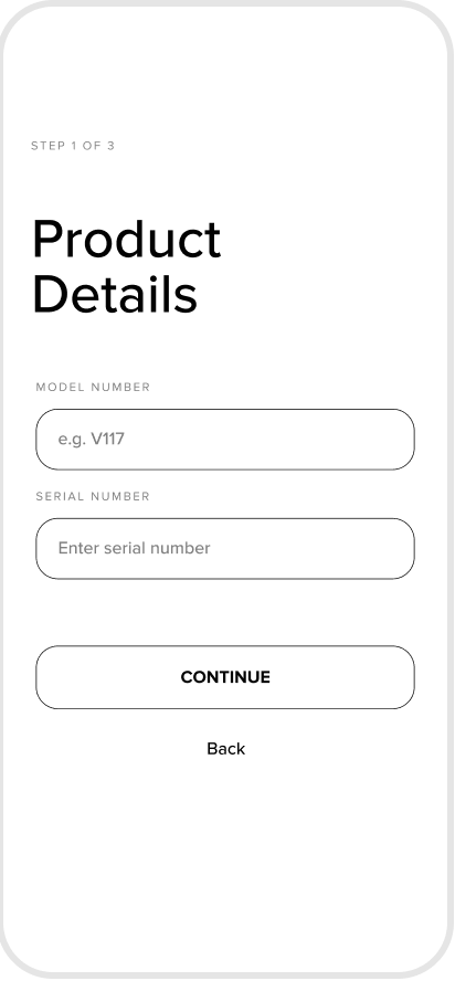
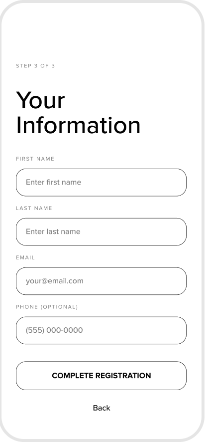
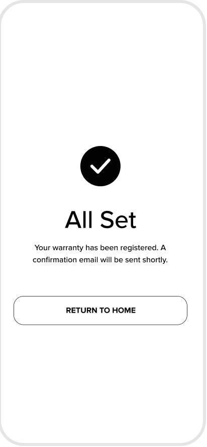
A design only holds together if it can be built the same way everywhere. So I documented the type, colour, spacing, navigation, and controls in a design system that developers can work from.
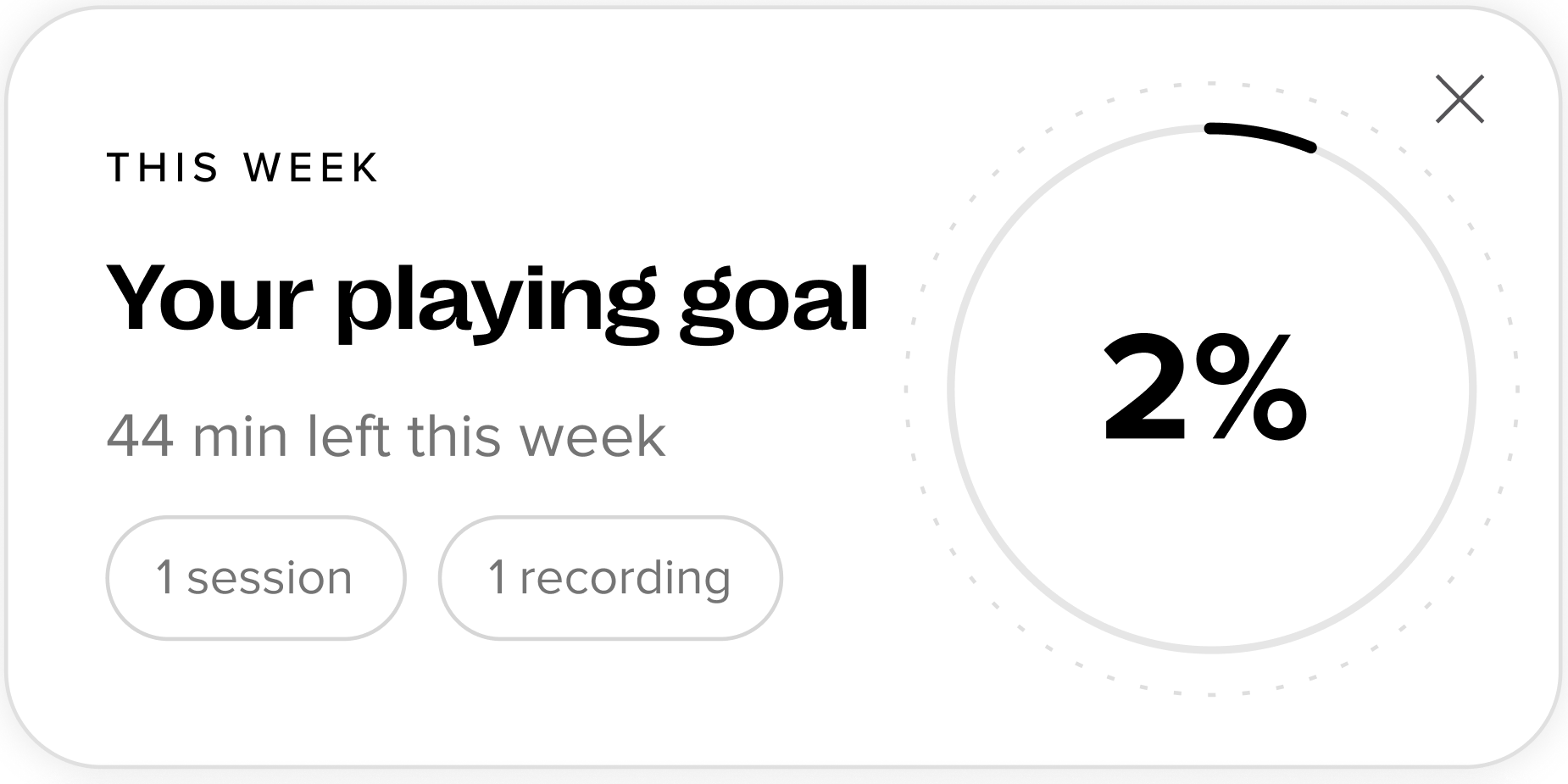
I also built parts of it myself in the app’s codebase, such as the weekly goal card, and made working prototypes, so that layout, states, and motion were settled before handoff, not left to interpretation.
What started as a half-finished app is now one complete, documented product design.